Web Design Trends That Are Dominating This Year
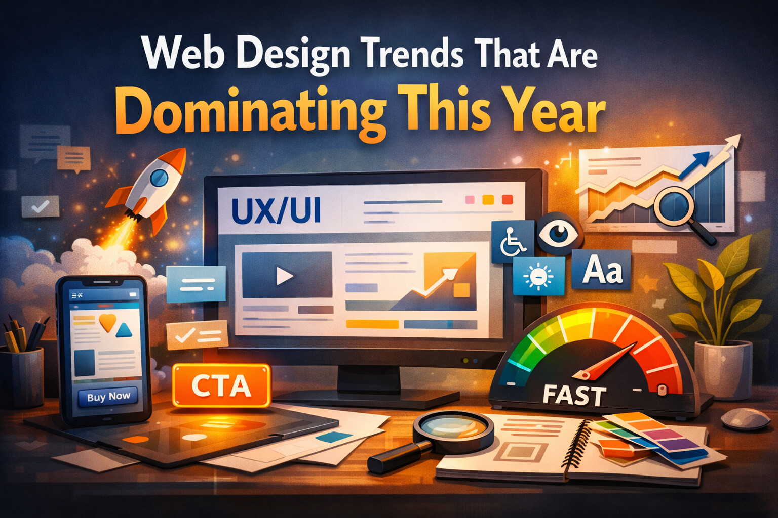
Web design is no longer just about looking good — it’s about performance, clarity, and user experience. This year, successful websites are the ones that load fast, guide users naturally, and remove friction at every step.
Here are the web design trends that are dominating this year, and why they matter for businesses.
Performance-First Design
Speed is now a design requirement, not a technical afterthought. Designers are working closely with developers to ensure layouts are lightweight, animations are purposeful, and assets are optimized.
Key focus areas:
- Minimal layouts with fewer heavy elements
- Optimized images and fonts
- Reduced JavaScript where possible
- Layouts that avoid CLS (Cumulative Layout Shift)
Fast websites don’t just feel better — they convert better and rank higher on Google.
Simplicity Over Visual Noise
Design is moving away from cluttered pages and unnecessary effects. Clean interfaces with clear hierarchy are winning.
What this looks like:
- Clear typography with strong contrast
- Plenty of white space
- Fewer colors, used intentionally
- One clear call-to-action per section
Simple doesn’t mean boring — it means focused.
UX-Driven Layouts
Design decisions are increasingly driven by user behavior, not trends alone. Layouts are built to guide users naturally through content.
Common UX improvements:
- Clear visual flow from top to bottom
- Predictable navigation patterns
- Reduced cognitive load
- Content structured for scanning, not reading walls of text
Good UX is invisible — users just feel that everything “makes sense”.
Accessibility by Default
Accessibility is no longer optional. More designers are building inclusive interfaces from the start.
Key accessibility practices:
- Proper color contrast
- Readable font sizes
- Keyboard navigation support
- Clear labels and form feedback
Accessible design improves usability for everyone, not just edge cases.
Micro-Interactions With Purpose
Subtle animations and micro-interactions are still popular — but only when they add value.
Examples:
- Button hover feedback
- Loading indicators
- Form validation animations
- Navigation transitions
The goal is feedback, not distraction.
Mobile-First Is Still the Standard
Most users experience your site on mobile first. Designs now start with mobile layouts and scale up — not the other way around.
Mobile-first priorities:
- Thumb-friendly interactions
- Readable text without zooming
- Simplified navigation
- Optimized images for smaller screens
If it doesn’t work well on mobile, it doesn’t work at all.
Design That Supports Conversion
Design is closely tied to business goals. Every section should have a purpose.
Conversion-focused design includes:
- Clear messaging above the fold
- Strong visual hierarchy
- Trust signals (reviews, testimonials, badges)
- Obvious next steps for the user
Good design doesn’t just look nice — it drives action.
Final Thoughts
The dominant web design trend this year is intentional design. Every color, animation, layout choice, and interaction should serve the user and the business goal.
At Code Trail, we design interfaces that are fast, clear, accessible, and built to convert — not just follow trends.
If your website feels outdated or underperforms, it’s usually not about looks — it’s about experience.